Location is part of the opening information
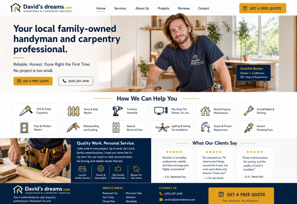
The heading describes a “local family-owned handyman and woodworking professional,” and the supporting line names Redwood City and surrounding areas. That information answers a practical eligibility question: does this business serve the visitor’s location?
For a local service website, a location line is useful before the enquiry rather than buried in the footer. It also keeps this example grounded in its actual market. The screenshot is not evidence of a service location in Israel, and the analysis does not recast it as one.
The photograph shows the work rather than a stock symbol
The right side shows the owner using a drill on site. A small owner/craftsman label sits over the image. Below, another photograph accompanies the “Quality Work. Personal Service.” introduction. The visual explanation is about a person doing practical work, not an abstract business graphic.
The photograph and label help identify the provider, but the claims about reliability in the surrounding copy still belong to the business. They should not be turned into an unverified endorsement in a design study.
A broad service list becomes a scan-friendly grid
“How We Can Help You” introduces twelve service tiles. Visible examples include trim and finish carpentry, fence and gate repairs, furniture assembly, drywall repair and patching, door and window repairs, and faucet and fixture replacement. Icons and short labels make the range scannable.
The challenge is breadth: a visitor should not have to read a paragraph listing every repair before finding their job. The grid supplies a first-level map. More detailed pages or project descriptions could explain scope and exclusions where a short tile is insufficient.
Call and quote serve different enquiry styles
“Get a Free Quote” and “Call Now” are paired in the first screen. A ready-to-talk customer can call, while someone describing a less urgent job can start a written enquiry. The header repeats the quote action, keeping it available above the service list.
The lower section includes a client-review panel. Reviews can add context when their source and permission are established, but this study does not independently authenticate the quoted reviews. The observed design decision is where they appear relative to the service explanation.