The screenshot is about a media brand
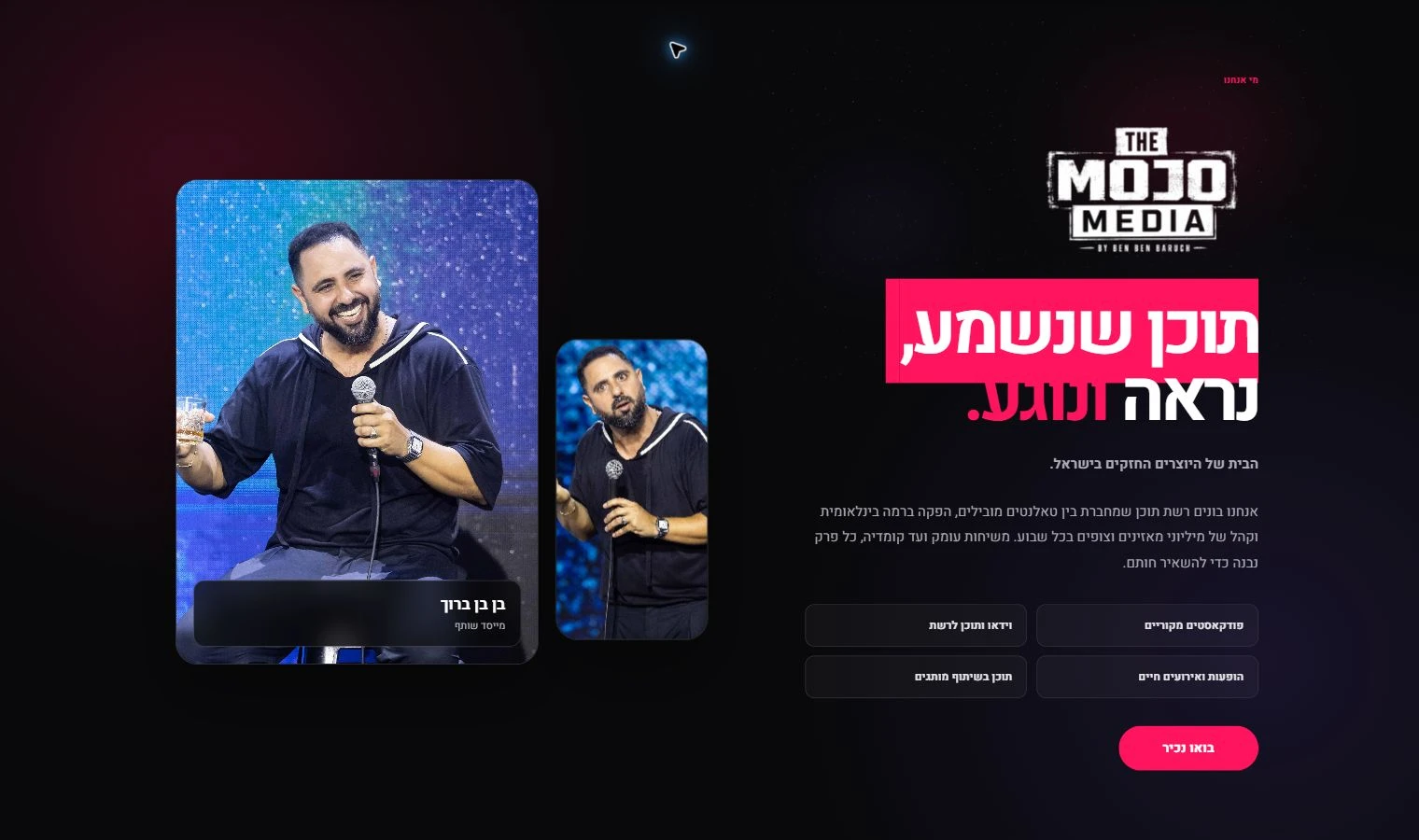
The capture names a content network, features the founder and lists original podcasts, video, live performances and brand collaborations. Those visible categories make the section a useful example of introducing a media business with several kinds of output.
The page therefore works as an example of presenting a media brand’s identity and content range. Describing it as a studio-booking funnel would attach a purpose the retained material does not establish.
Two photographs support one identity
A large portrait of Ben Ben Baruch occupies the left side, with a smaller portrait beside it and a founder label along the lower edge. The right side carries the Mojo Media mark and Hebrew headline. The imbalance is intentional: the people and performance imagery hold one side while the explanation holds the other.
The photographs show the founder with a microphone in performance settings. They explain the personality behind the network more directly than a generic microphone icon or studio stock photograph would. The design does not need a lengthy biography before introducing the content.
The Hebrew headline uses colour to separate phrases
The opening phrase appears in white on a bright pink block; the following words continue in white and pink against the dark background. Below, smaller Hebrew copy describes the network. This creates a clear visual progression from the mark to the statement and then to the explanation.
The design should be evaluated in its right-to-left context. A bilingual adaptation would need a deliberate English line break and text arrangement, not just a direction switch applied to the same typographic composition.
Four categories explain the range before the action
Four bordered tiles name original podcasts, video and online content, live performances and events, and content in collaboration with brands. The categories let a visitor distinguish programming from commercial collaboration without placing every programme in this section.
The pink “בואו נכיר” action follows the category tiles. It is an introductory invitation rather than a ticket or shopping action. The screenshot does not show where it leads, so it cannot establish a booking workflow or lead-generation outcome.